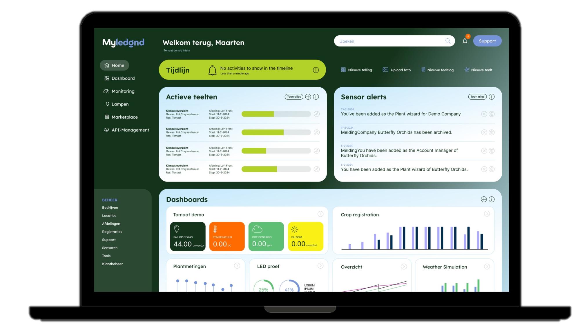
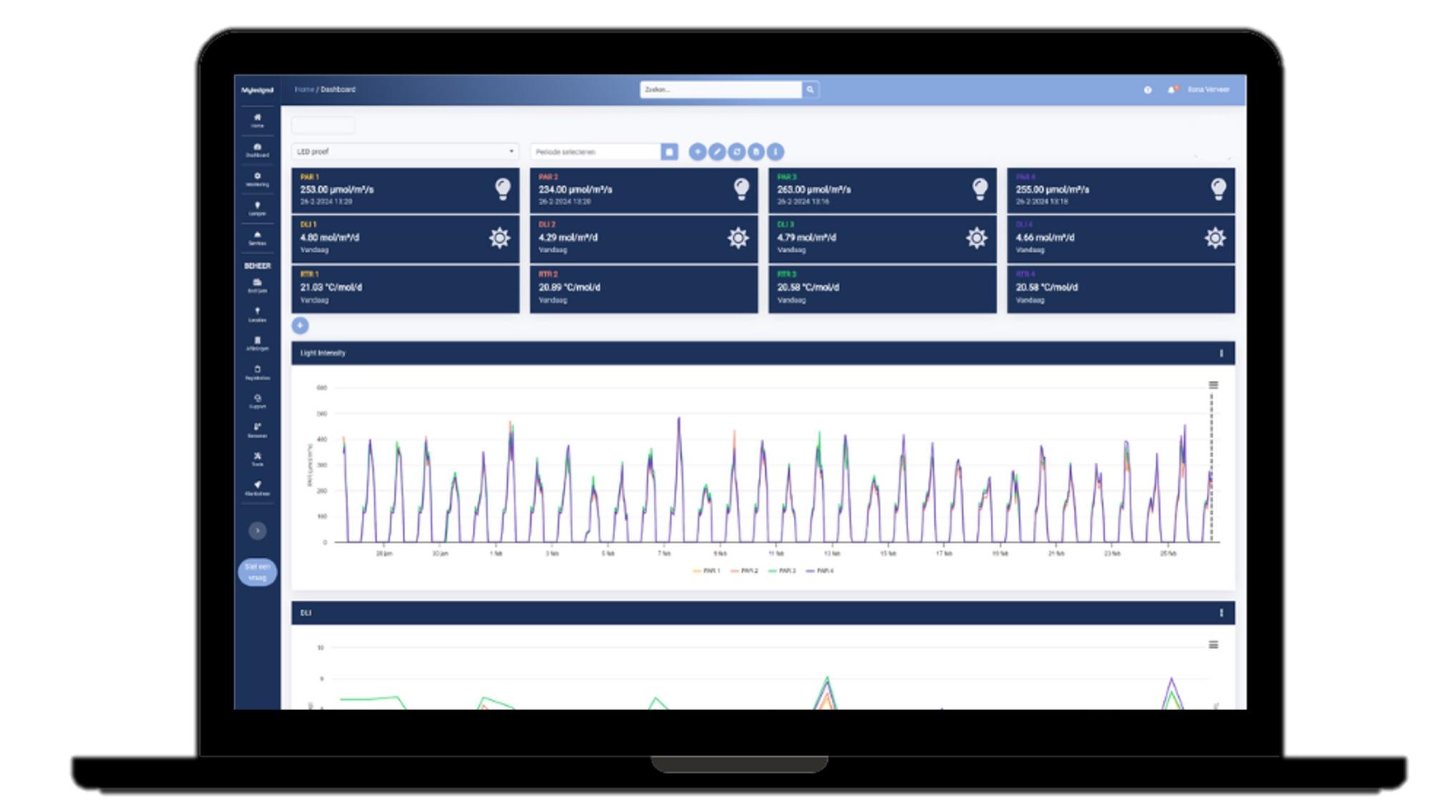
With the new interface of MyLedgnd, as a grower, you gain more control and power over your own data and can manage the APIs yourself, allowing you to independently manage your portal.
New Design MyLedgnd
Benefits:
- Improved user-friendliness and intuitive navigation
- Modern and attractive visual design with new color scheme
- Better accessibility and clarity of complex data
- Easy integration with other systems and sensors
- More control over which data is collected and used
- Optimized for both desktop and mobile devices
The new design of MyLedgnd has been developed with the user in mind, emphasizing simplicity, speed, and ease of use. The interface has been completely revamped with a sleek and modern look that is both functional and visually appealing. The usability of the platform has been significantly improved by the new look and feel, allowing users to work faster and more efficiently.
Additionally, we have revised the navigation to make it more intuitive, so users can effortlessly find what they need. The new design is also fully responsive, meaning it works perfectly on both desktop and mobile devices. With this update, we aim to ensure that every interaction with MyLedgnd is a productive experience.
Maarten van Bemmel about the new MyLedgnd design

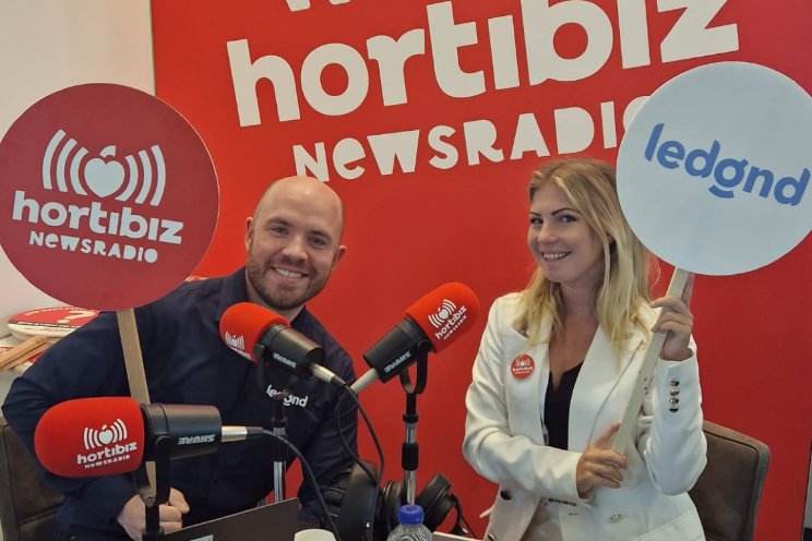
During GreenTech, Maarten van Bemmel, Product Owner of MyLedgnd, was interviewed by Hortibiz News Radio about the new design of MyLedgnd. Listen to the interview below.
Do you want to know more?
Would you like to know more about the new MyLedgnd design or would you like to try the platform for free? Leave your phone number and we will contact you as soon as possible.


